UX · Wireframes · Healthcare · Pharma
Savings Card and Learning Modules
A comprehensive wireframe system designed to help patients understand and access savings programs for two Lilly medications. Built across two drug tracks with distinct user flows, coverage scenarios, and savings pathways.
WIREFRAME SYSTEM / Coverage and savings modules across two drug tracks
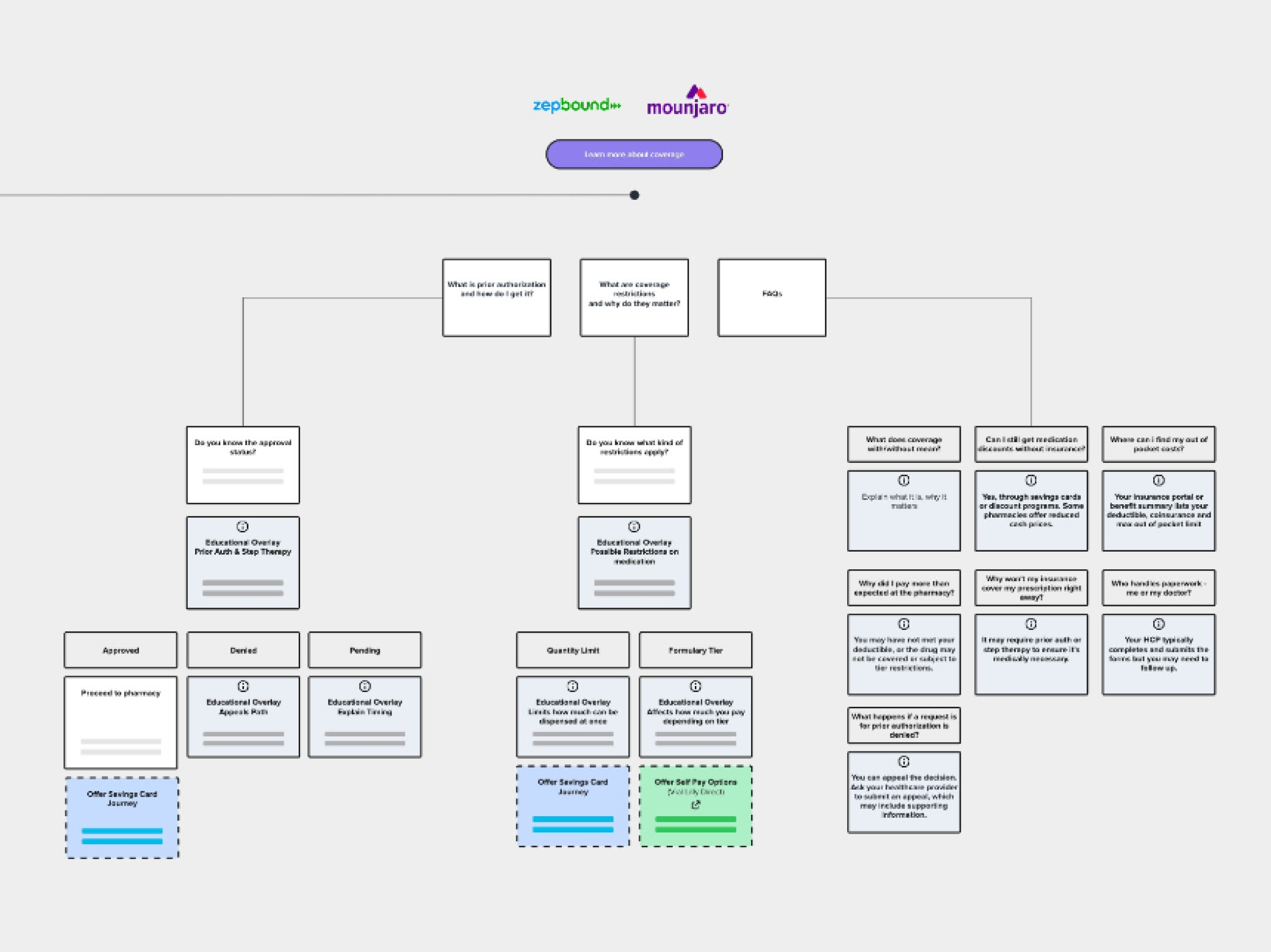
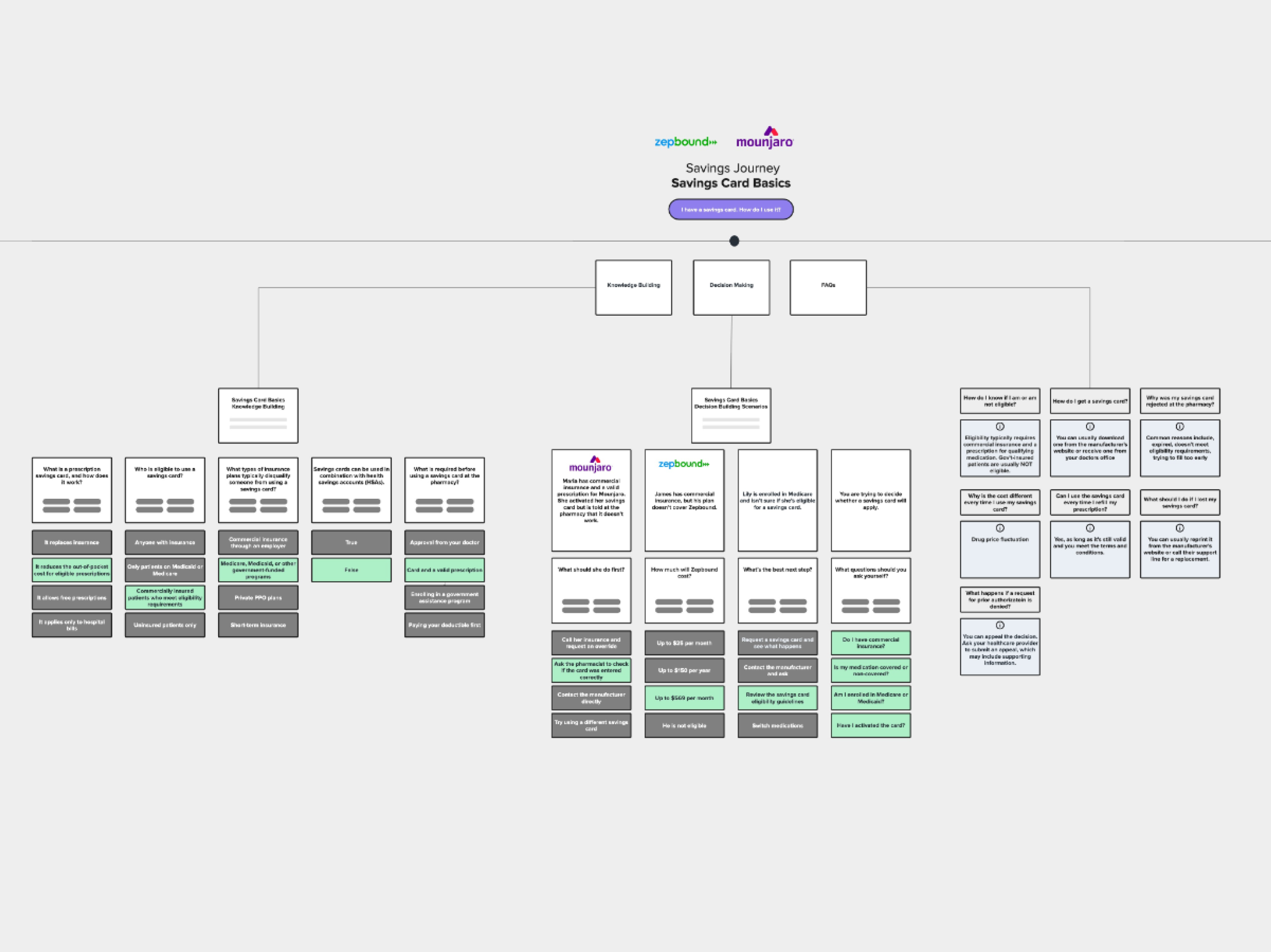
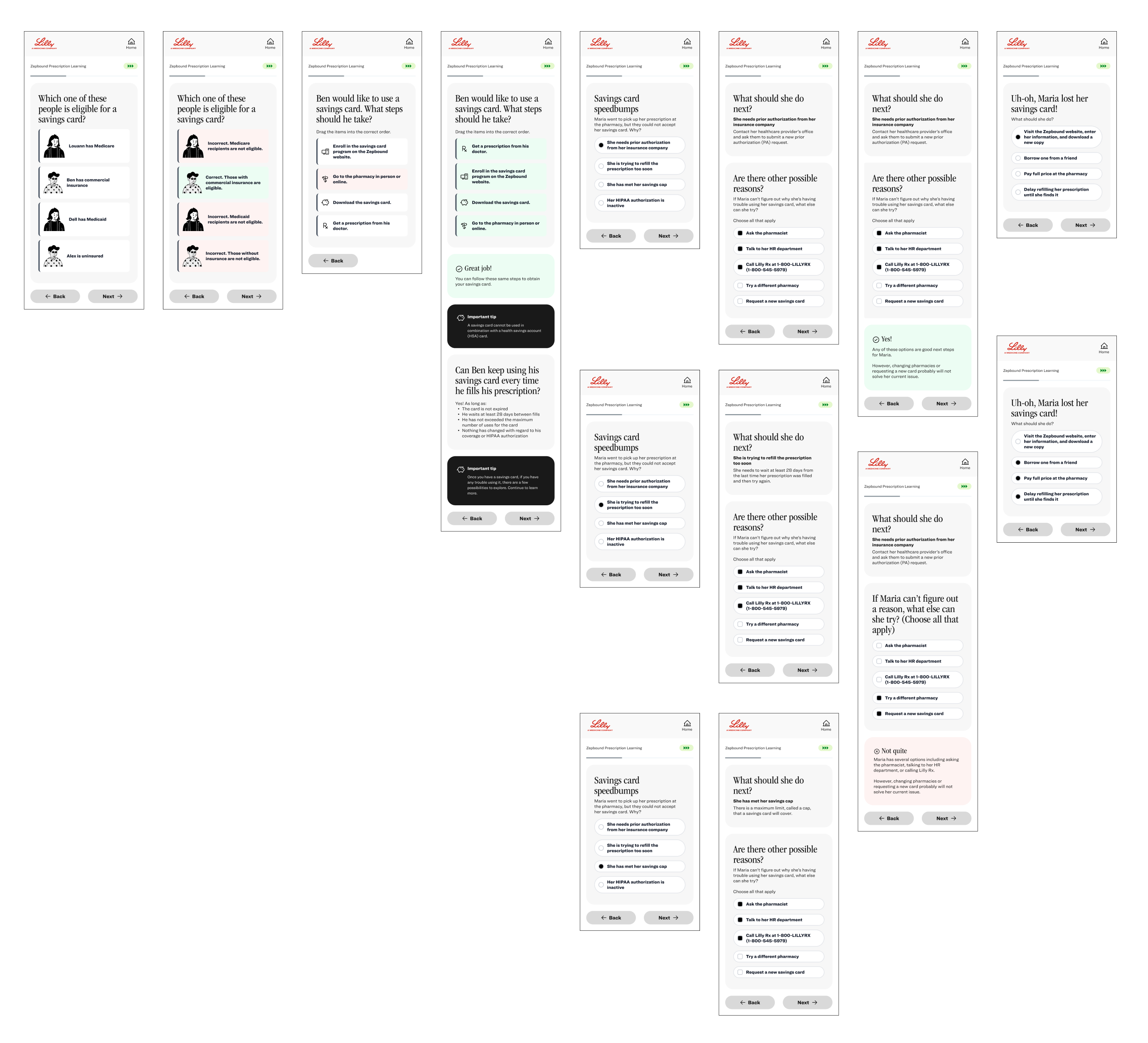
Patients prescribed Zepbound or Mounjaro needed a clear, guided way to understand their savings card options and coverage eligibility. The existing experience lacked structure and left patients confused about how to access financial support. We were brought in to design a modular wireframe system that could serve both drug tracks without duplicating effort.
UX Designer working alongside a design director from user flow mapping through final wireframe delivery. I led the day to day design decisions across all modules.
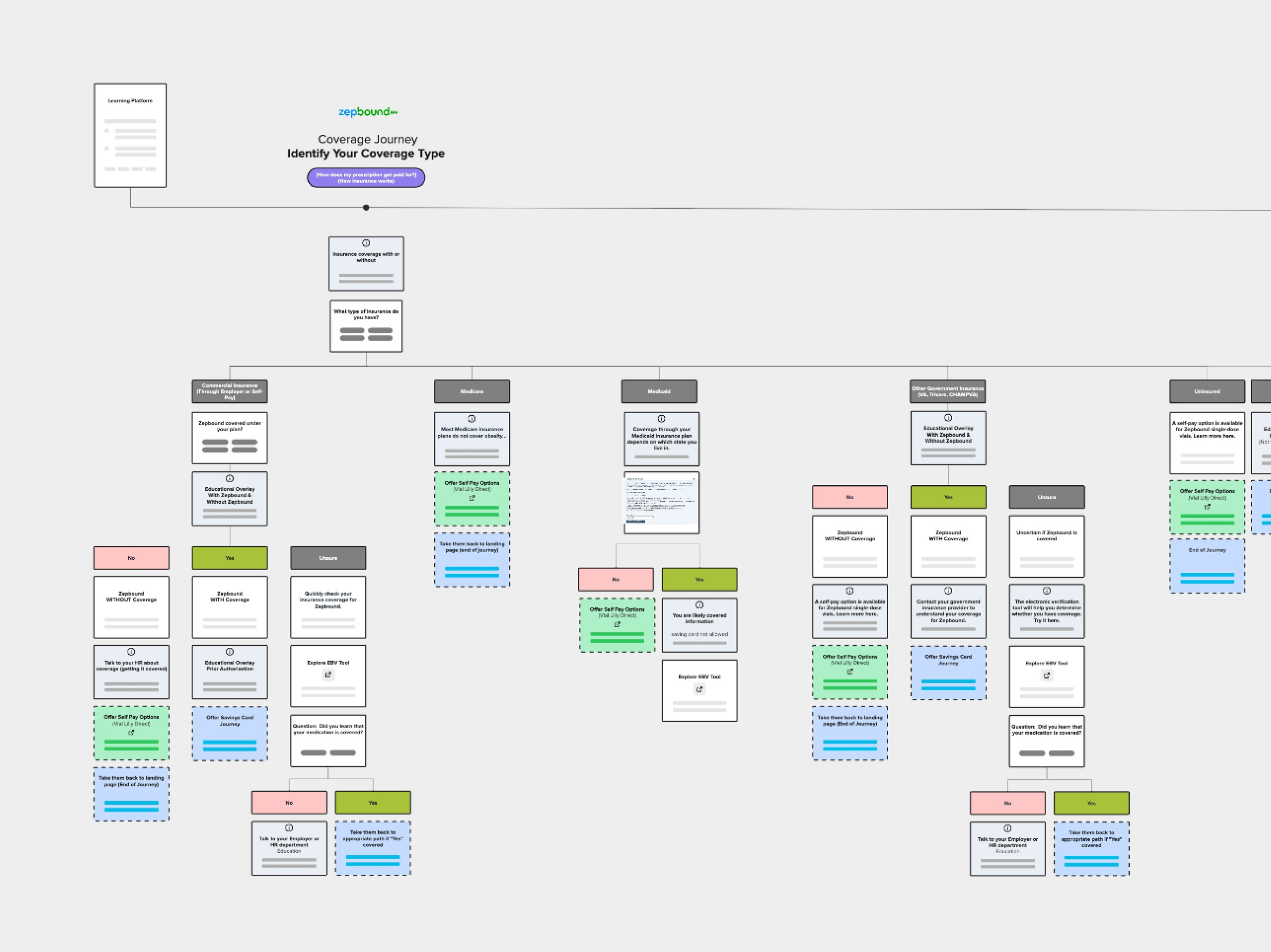
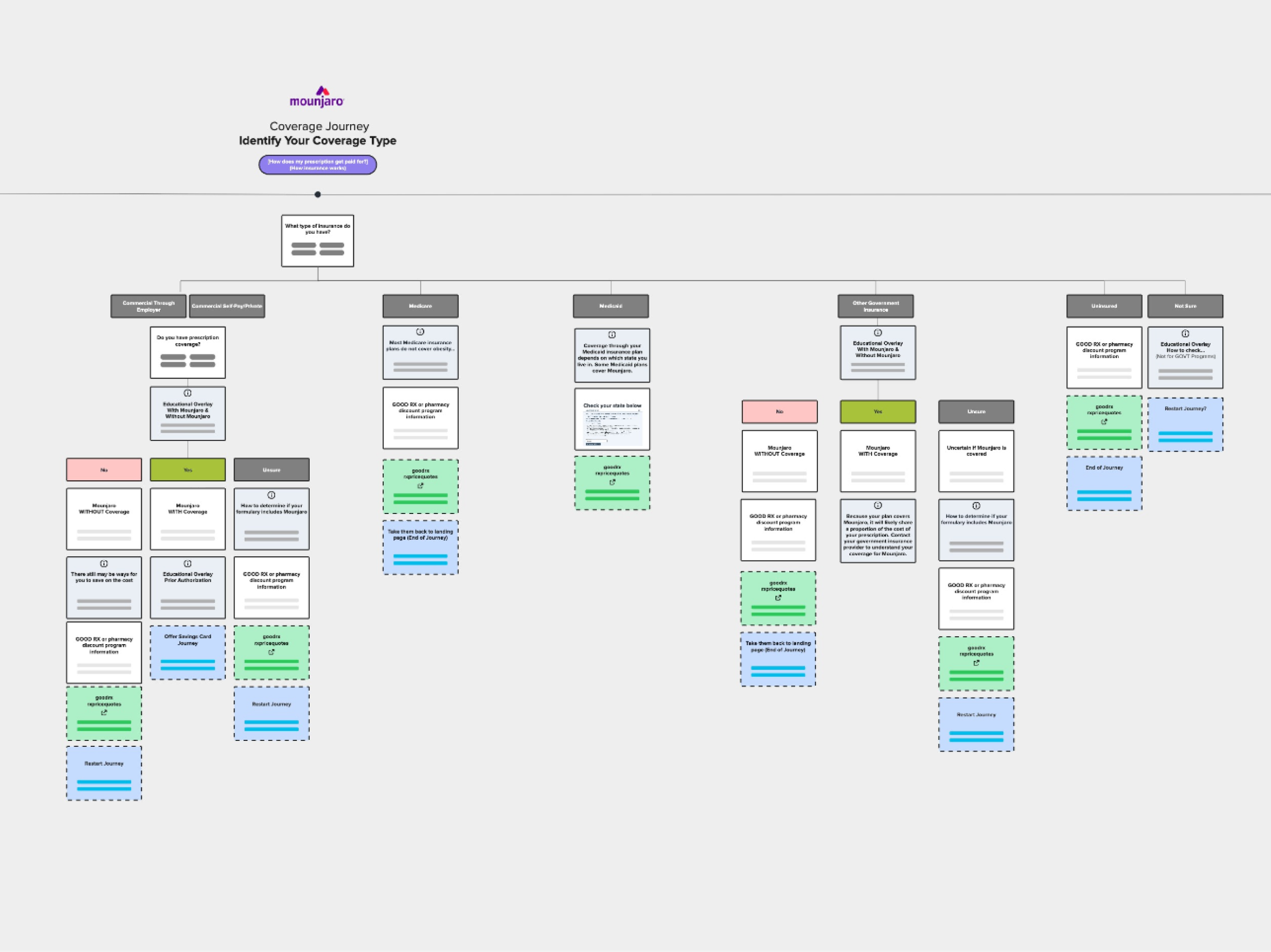
- Mapped user flows for both Zepbound and Mounjaro savings card journeys
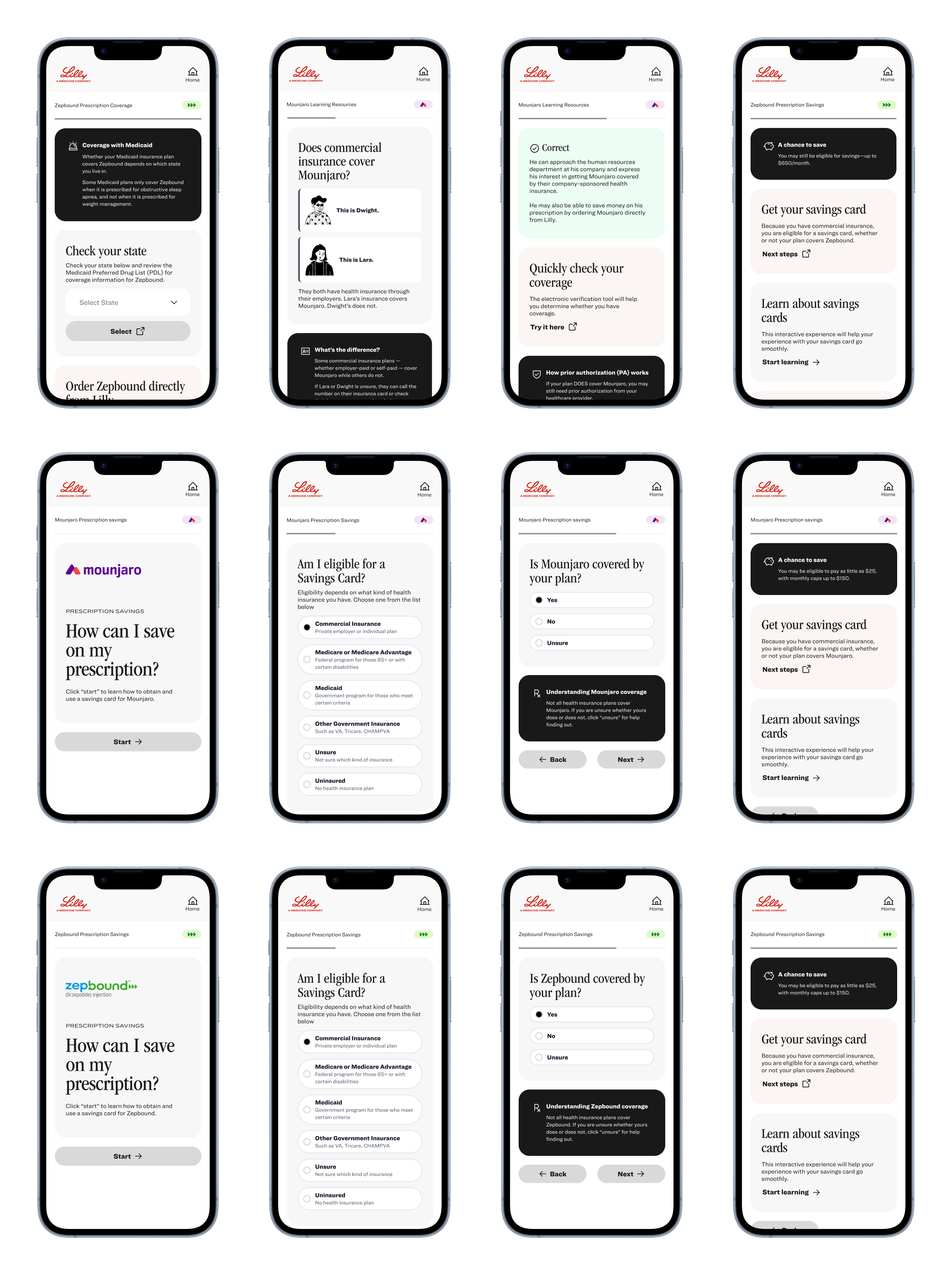
- Designed wireframes covering coverage scenarios, savings modules, and landing page structure
- Built the system to scale across two drug tracks with shared logic and distinct pathways
- Delivered a complete Miro board with annotated flows and wireframes ready for handoff
COVERAGE AND SAVINGS JOURNEY / Miro board flow mapping
The Result
- Delivered a complete wireframe system covering both drug tracks across all key patient scenarios
- Miro board documented all flows, wireframes, and module logic ready for development handoff
- System was designed to scale to additional Lilly drug launches beyond Zepbound and Mounjaro
The project ran in 4 structured phases, each building directly on the last.
- Mapped both drug tracks separately to understand where the patient journeys overlapped and where they diverged
- Designed a modular structure so shared components could be reused across Zepbound and Mounjaro without rebuilding from scratch
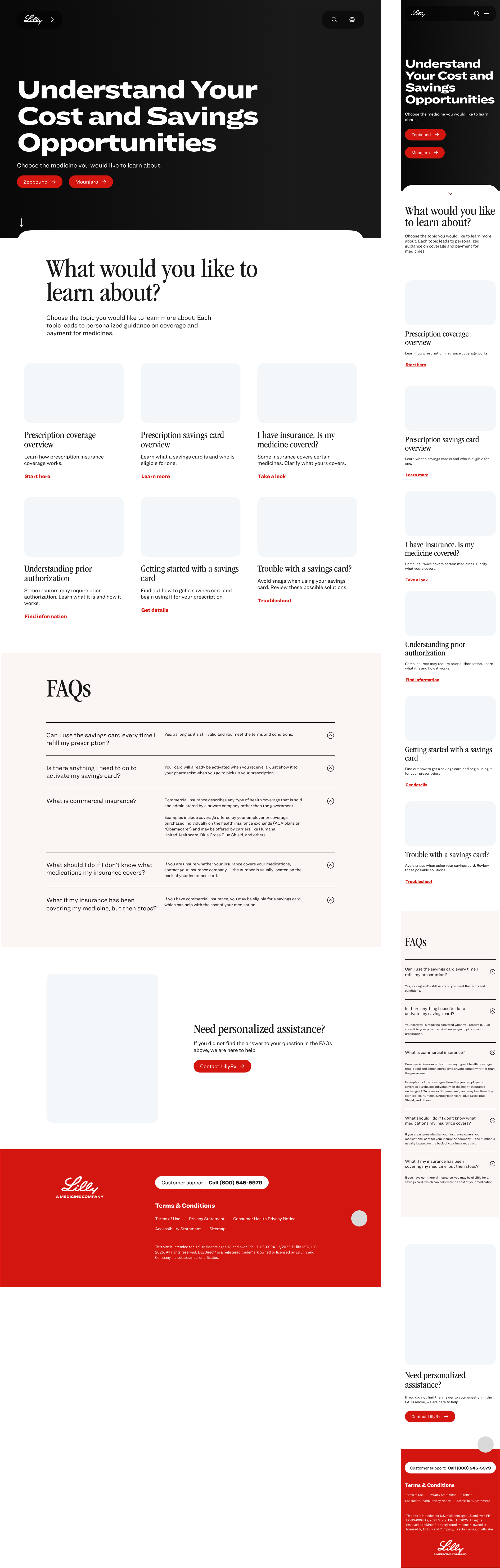
- Covered four key scenarios per track, landing page, coverage check, savings card activation, and desktop view
- Prioritized clarity at every decision point, patients needed to know exactly what they qualified for and what to do next
MODULE LOGIC / Decision points mapped across both drug tracks
Final Wireframes
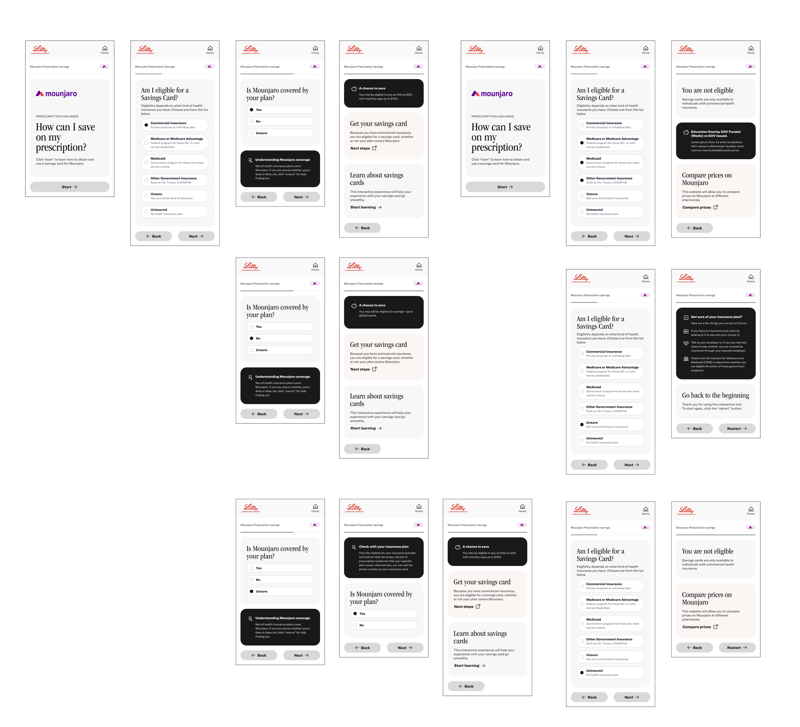
Landing page mockup